

Scene is an entertainment rewards program in partnership between Scotiabank and Cineplex. By turning movie tickets and financial transactions into points, the program allows users to get free cinema tickets, meals and digital gift cards across various restaurants and retails.
While providing amazing value to customers through its rewards program, the mobile app has some major pain points in UX/UI, which doesn't only impact the user experience and therefore desire and ability to engage with the service but also the operational costs of the business.
Scroll down to walk with me through the pain points and some potential design solutions

User Flow: Login

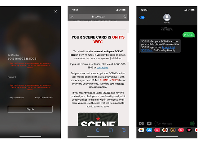
"Forgot Password?" Screen
Currently, if the user wants to reset a password, the verification process neither gives the user an option, nor specifies whether the code is being sent via email or phone number.
If their phone number changed for instance, and the chat feature is also not being accessible from this screen, the only option left is to call customer support.
"Forgot Card Number?" Screen
The app opens a browser window to confirm the request for the card number.
The page informs the user about possibly of uploading Scene Card on a mobile device and gives texting instructions to put the card on a phone. Yet the response text message prompts the user to download the app, even though initially the user came to that page from the app.
User Flow – In App Navigation

The menu is not intuitive with the inbox at the centre instead of 'my account information'.
The inbox feature seems redundant as the user is unable either to start a chat from there, or see any of the history or customer support messages.
If the user is trying to find a deal or redeem/earn points at the particular restaurant or retailer, the only option the user has is to scroll through.
The only available navigation is to sort by categories.

User Flow – Customer Support

The location of chat window, although might be intuitive for many users, is only displayed after the user follows through a number of navigation options.
Moreover, the design of the "Contact Us" screen presents a number of options with capitalized text and large elements, yet none of those options offer the user a direct way of contacting the company. Hence, such navigation design makes it confusing and unclear for the user what the options for contacting customer support are.
Ironically, after the user has already started the chat with customer support, the option to start a chat is displayed very clearly along with the number for customer support.

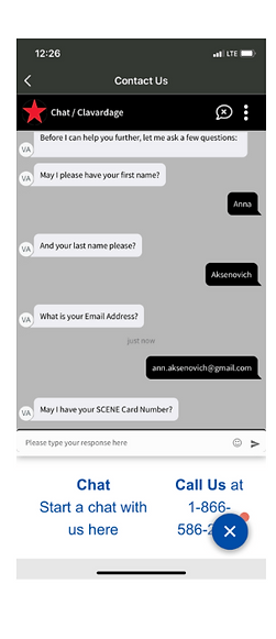
The user is required to jump a number of hoops to be able to even ask a question or submit an inquiry.
Apart from having to share personal information,
the user is asked to enter their Scene Card number which is a 16-digit number.
The process gets even more complex when the user tries to navigate in order to find their scene card number that is being requested.
Once the user navigates away from the chat, the chat window icon is no longer displayed at the bottom.
The user then would need to follow a number of navigation options to get back into the chat.
The card number is also not 'copy-pastable'.
The best design solution is to integrate chat into the app so the AI recognizes the user and doesn't require all the additional information.

Information Architecture

Design Solutions

Chat Feature
Creating an integrated system so the user is not required to type all the personal information and can move straight to their question.

Menu Options
Additional navigation in the menu bar so the user can easily locate their points history as well as general account information
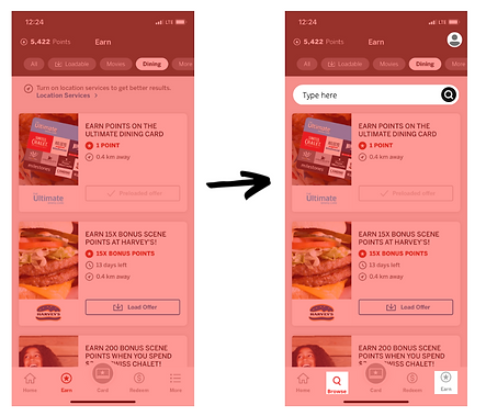
Navigation
Adding a search toolbar so the user can easily search through the available promotions as well as within the categories

Password Reset
Providing an option whether the user wants to receive the code via the email or the phone number, reducing the customer support calls and thereby operational costs.
Redesign Process


Navigation Redesigned
Adding a navigation tool bar also entailed adding an additional button at the bottom of the screen for a "browse" mode. The 'more' menu is moved to the top and replaced by account icon.
Before After
Contact Us and Chat Features Redesigned

The re-designed screen features a simpler and cleaner look with the white chat background.
I have also removed the "Start a chat option" that might confuse users since this is the window where the chat has already started.
I have kept the option to call customer service. However, with the goal to reduce call volumes and thereby operational costs, I have made the text smaller so it is visible but doesn't serve as a go to option in the chat window. Unlike the previous design, the number is now clickable so if the user chooses to call it would be just one click away.
Before After

In the redesigned screen, FAQ is brought to the top of the list in order to prompt the users to find the answers to their questions before proceeding to contract customer support directly.
It provides a quick menu guide underneath that gives users both an idea of what kind of questions they might expected to be answered in FAQ section as well as shortcuts to the most common queries.
The call option is also added here which previously was under a different navigation item altogether. This makes the overall menu less crowded and helps the user find all contact options in one place (Contact Us page) as would be expected.
Before After

Reflection
The friendlier app design with added navigation features, and a simplified chat that detect keywords and offers users a direct answer from FAQ if available, creates not only a better and smoother user experience but can help Scene save on operational costs.
Before the redesign the most straightforward option was to call customer service, which is further reflected in the high call volumes and thereby greater hold times for customers.
Giving users an ability to find answers to their questions on their own with an ease or with minimal assistance creates a win-win scenario for all stakeholders.