
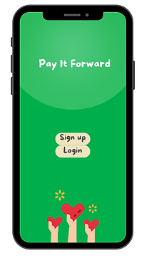
Pay It Forward
An app for flexible volunteering to solve the problems of food security and food surplus by connecting volunteers to pick-up and drop-off locations around the city.
Problem
While there are a number of NGOs tackling the problem of food insecurity, the majority of them are focused on supplying food to the shelters.
However, shelters have limited capacity, leaving a large population of people living on the streets and relying on the kindness of by-passers.
Pay It Forward aims to close that gap and provide a solution to the problem of food insecurity for homeless individuals.
Challenges
Create an easy to use volunteering app
Provide a low commitment way of doing good
Respond to the growing desire for altruism amongst millennials
Connect the places of surplus with people in need
Key Questions
-
How can volunteering become an easy and low commitment task that anyone can complete on a go?

-
What are the main barriers to volunteering amongst millennials?
-
What are the main drivers for volunteering amongst millennials?
Primary Research
Having spent two years volunteering as a Communications Coordinator for RHA Canada, I have gathered a large chunk of primary data from interviews, participant observation and social media archives. My position of volunteer also helped me to gain an insider's view on the problem and inspired the creation of this project.

Here is what I heard from people...

Distilling insights
Main barriers to volunteering:
- Lack of time
- Logistical issues
- Inflexible volunteering schedules
Main motivations:
- Gaining transferable skills
- Desire to help others
Secondary Research
To gain a better understanding of the motivations and barriers to volunteering, I did some further secondary research – reviewing academic literature and statistical data.
And it confirmed the earlier findings...

While the likelihood of volunteering decreased with age indicating an upward trend in volunteering amongst millennials, the younger generations had the lowest average of hours volunteered.
These findings further support primary data that younger volunteers have limited time resources and thereby have a greater need for a simplified and time efficient volunteering process.
(Source: Statistics of Canada, 2021)
Project Vision
Think Uber Eats, but the food is being delivered by volunteers to homeless individuals within the downtown area.
Pay It Forward simplifies the logistical process of volunteering, giving users ability to choose their pick ups and drop offs per their convenience.
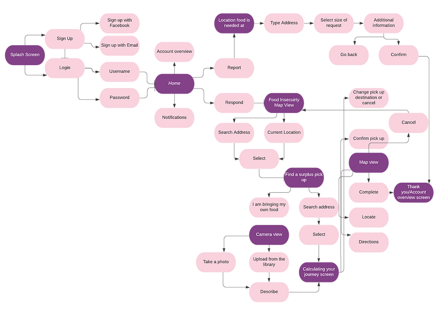
Volunteers and Donation Partners all have access to the same app with 2 main options: to report a need or to respond to one.

Integrated map feature enables to calculate a journey from/to pick up and drop off locations.
It also provides live waiting time and updates to pick up locations.
Based on the monthly data, the surge feature highlights areas with the most need.
Information
Architecture
Wireframes
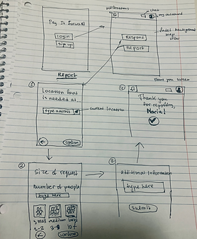

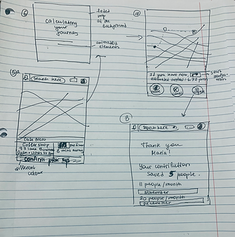
Low Fidelity
Respond Screen
Version B was created to contrast with Version A. Version A provides the ability to fill out the question using buttons with predetermined answers and visual aid, thereby providing a more interactive experience for the users.
While it might have an impact on the accuracy of reported size, discovery research revealed that most requests are estimated to be either small or medium.
Additional information field was first designed with the idea that the user can add any additional information (e.g. what type of food, items are needed).
In Version A, it could also be utilized to specify the number of people.
Version A Version B

Although the text boxes are designed for accuracy, as the user testing revealed they actually create a difficulty and sometimes confusion for the user trying to come up with an estimate (for instance, if there are a few people, or one person who is asking for a lot of food). This would also make it more difficult to categorize information that would correspond to surge areas on the map (where there is a lot of people in need). If the text box was only to allow users put in numbers, the previous problem of estimate would still remain and might lead users putting in arbitrary numbers or discourage from making a report in the first place. As a result, I went with Version A as it provides for a more user friendly design.
Design and Colour Exploration

High Fidelity Wireframes

Version 1 (alternative)
Version 2 (final choice)
Final Design Choice
With the goal to make volunteering not just simple and accessible but also fun, I have been experimenting with bright colours.
By analyzing NGO websites and apps, I found that the most used colours are red and blue, however I wanted to differentiate and went for the colours of green and purple. Purple seemed to be a little too bright as the main theme colour of the app as it emphasizes entertainment over the mission of the app.
The chosen shade of green is bright enough to entice enthusiasm, yet is also a peaceful colour that is too associated with giving. Green is also a color of the compost bins - associated with food recycling. It is also the brand color of Oxfam. In yoga and eastern cultures, green represents the heart chakra and thereby the spirit of giving.

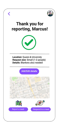
Other differences between the two versions include the design of the 'success' page, where the tick is replaced with a heart and a tick.
Although the simple tick is more recognizable, it also might create an impression that volunteering is just something you check off your to do list. In order to highlight the human aspect, I have added a heart, which fits well with the brand's logo. It implies sharing of love but also humanizes the people in need of help.
The navigation exit button at the right bottom corner has also been added, so users can easily navigate away from this screen without having to perform extra steps.