
Book Publisher - Mobile App
Role: UX Designer and Researcher
Duration: 3 months
The concept of the app, the logo and all the designs are mine.
This project has been initiated as a part of the Google UX Design course.
Scroll down to walk with me through my design process and approach:
* Or if you want more detailed overview of every step:
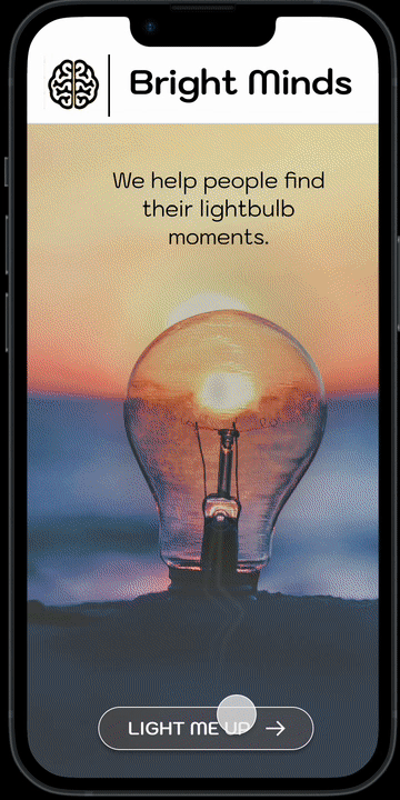
You could say... that we are the ones who keep the lights on in the world.
But no, we are not your local hydro company.
We have a slightly different way.
We help people find their lightbulb moments.
.png)
Part 1: Conception
As somebody with a strong background in research and writing, I usually start my design process with words rather than images. Especially when I have a creative power over name, logo and the whole design direction, I enjoy creating designs that connnects the brand and design in a coherent experience for the user.
Inspiration Board
I always thrive for cohesiveness in design but more so as someone who first and foremost designs experiences rather than products, if given an opportunity, I stretch those boundaries where the product and website/mobile app designs are inseparable part of the bigger whole.
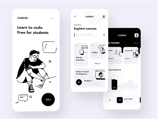
Here is one of my favourite examples that I used as an inspiration:
/coduck: has very clean and simple design yet very creative. The smaller font and lower case for their brand name although might seem as de-emphasizing, nonetheless does the opposite with the use of special characters that you rarely see in brand names but often in code, which is what the app is for! I also love how the text in the button "Start" almost blends in and makes it all seem a part of one picture (where button itself becomes a dot).
The instructional and detail orientated information is muted by using grey colours and is not unusual.
But what I found most interesting is the way information arranged hierarchically on the home page. The greetings "Hey Jerry" is smaller case and de-emphasized in contrast to search bar and "Search for" which is on par with "Explore Courses" text.
So when the user types, they basically finish the sentence (it is cleverly and subtly interactive).
Part 2: Discovery Research
My approach and methodology
In my designs, I follow Design Thinking methodology and tools for understanding and emphasizing with users.

I often utilize a mixed methods approach:
Secondary research - to conduct competitors analysis.
Brands and products never exist in the vacuum. Understanding competition can help to make strategic design decisions.
Primary research - qualitative and quantitative (where applicable and available)
To understand customers (or potential consumers) on a deeper level it is essential to ask questions that uncover behaviour patterns and can help situate quantative data in the context of person's life.
Specifically, I like to utilize journey mapping in my discovery analysis, as it helps to visualize the user journey and also outline very specific pain points in the journey and thereby opportunities for design intervention.
Step 1: Emphasizing with users - Journey Mapping

Main Pain Points
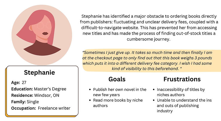
1. Findability of delivery information
Users mentioned being blindsided by delivery fees up to the last step in the checkout process.
Overall it is hard to estimate the delivery cost ahead of time as often the site estimate list them based not only on location but on the weight of the items.
2. Searching and exploring niche titles is a frustrating experience
One of the main motivations for the users ordering books directly from the publisher is access to niche titles which they might not be able to find anywhere else. When the app and web experiences limit their ability to do so, they get frustrated and often abandon the process altogether.
3. Difficult and not straightforward checkout process
Users mentioned that often they have to create an account and go through a number of steps to make a
purchase.
User personas
I often use personas in my work as a researcher. Apart from its wide spread use for marketing and audience messaging, user personas often naturally emerge from the discovery research. Representing a set of behaviours and characteristics of the group of users, a persona allows to ground the design process and define the problem statement with the user centric lens.
Here is an example of persona I have created for this project:
Note: I have created much more comprehensive personas along with user archetypes, which are similar to personas but are more focused on the behavioural and motivational aspects.
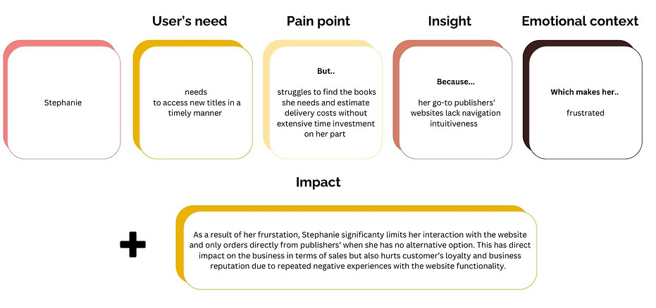
Step 2: Defining the problem
Problem statement is crucial to keeping the design process grounded. Especially so, when the research results are full of insights but the work has to be really focused around one major area. Problem statement also serves as a reference point throughout the design process, which in my experience improves communication between cross-functional teams.
For this project, I have integrated insights from the research and used the persona to create a user-centric point of view (which often is a great reminder during the design process that I am in fact designing for a real user and person!)
"Impact" in my problem statement is an addition of my own to the common template used in Experience Design. It helps to connect user needs and problems to the business objectives and therefore impact.
In my approach to design and research, I always keep in mind all of the three vital components:
- User needs (desirability)
- Technical feasibilty
- Business objectives (viability)
I know how easy it is to get lost in either of those, especially when you are very immersed in your own speciality, whether that means being a developer, designer or business stakeholder. Finding the intersection of these three but also communicating it to others is something I do in my day-to-day role as an Experience Designer.
Part 3: Ideation
Ideation is my favourite part of the process, this is where I let my imagination run free and experiment with different visual elements and styles.
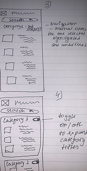
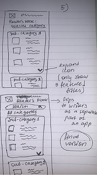
Paper Wireframes
I drew some wireframes on paper first. It helped me to narrow down some ideas I had around how the navigation might work given the app is to feature a large number of categories and subcategories.
Specifically. I tried on different ways to layout categories in the app such as carousel menu that would create more immediate space on the screen and ability for the user to see what is within each category without having to click on it.
I also tried out (Picture 2) breadcrumb navigation - taking into account that user might want to navigate into subcategories.
This is also a time when I made a decision to divide the mobile app into 2 major views based on its two main user groups: writers and readers. The function of each view and the action those users want to perform are different. Having such separation (similar to the one between Riders and Drivers that exists on Uber app) would remove unrelated menu items from the immediate visibility of the user. I explored the idea of having a flip function at the top that would also acommodate for users that fall under both segments.

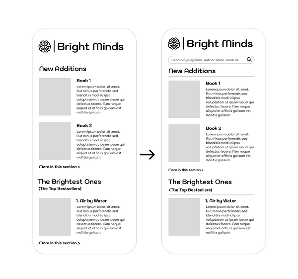
First change to the initial conception was in bringing the emphasis to the company name through the addition of the white colour filled section at the top.
Additionally, the style of the button has also been changed. The rounded design creates the consistency of the overall look (such as through the round elements in photography and the style of the font that feature soft corners)

The decision to bring company logo in this design was especially significant - not only from the standpoint of brand recognition but also given that the company name could read as a standalone phrase, it was important to create even more emphasis to the branding through design choices.
The last major change to Splash screen was in creating visual hierarchy through changing the size of elements and the font.
By creating consistency in the font size, the image fades to the background.
The larger font for the tag line also makes it hard to miss and further strengthens branding.
The larger font for the button was however decision related to usability. It is important for this element not to get lost visually and ensure the user knows exactly where to click on to proceed to the next screen.

Splash Screen Interaction Explained:
The interactive element seamlessly fits in with the theme - of lighting up a lightbulb and metaphorically referring to lighting up minds through books.
The interactive element creates more engagement for the user as well as gives users a sense of agency - being a co-creator of the experience.
From the design perspective, there were a couple of options to choose from. The starting image could be black and white and the light up effect would have been more dramatic. However, the black and white didn't make for a natural transition. In the absence of alternative shots of the same photograph (the one without the sun would have worked well here!), I used image effects in Figma by creating color overlays on the first screen and then adding saturation through the use of color on the second screen. This way, although the whole photograph 'lights up', the concentration of color is still on the lightbulb specifically, thereby drawing the user's eyes to it and creating a more 'natural' effect to the way light radiates from the lightbulb.

The decision to bring company logo in this design was especially significant - not only from the standpoint of brand recognition but also given that the company name could read as a standalone phrase, it was important to create even more emphasis to the branding through design choices.
Emphasis by using bright colours that are cohesive with the Splash screen design was also important not only for visual UI aesthetics but also for usability. Adding colour filled shapes to the titles of categories makes them standout and visually draw attention as they are being the most important navigation point in this screen.
After creating this initial design, I have given it more thought from the user experience standpoint and thereby added additional navigation features.


While I decided to keep the colour-filled elements from my initial design, I have placed the title text outside of them, thereby creating a 'bookmark' look but also increasing readability of the text and meeting accessibility criteria.
I also changed the section containers, which visually added emphasis to the elements that are grouped together and reflect the interactive function of the cards.
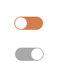
The toggle off/on allows the user to easily choose which categories they want to see and navigate between them without having to take any extra steps or browse categories separately on the screen.
This particular design is useful when there is a great amount of content with various categories and subcategories. This way the main menu can allow the use to browse through main site categories without overcrowding it and overwhelming the user with various book subcategories.